Interactive Learning Pages

Role
UX Designer
Company
McGraw Hill
Tools
Axure
Project Overview
Explanation pages in ALEKS Learning Mode traditionally provided static, step-by-step guidance for each math topic. While effective in delivering information, these pages were frequently described as flat and unengaging by students and internal stakeholders. To address this, the new interactive learning model introduced animations, interactions, and responsive feedback to create a more dynamic and engaging learning experience.
Goal
Design an interactive learning page model that enhances comprehension and engagement for students from 5th grade through higher education, while complementing the existing static explanation pages.

The traditional explanation page described as “flat” and “not engaging”.
Content Design
I collaborated with the math content team to identify which core concepts could benefit from a more visual and interactive presentation. We worked together to break down explanations into smaller, digestible parts that could be enhanced through animations, layered information, and feedback-driven interactions. Cultural appropriateness and age relevance were key considerations throughout content design.

Early concepts in PowerPoint provided by the Content Team.
Interaction Design
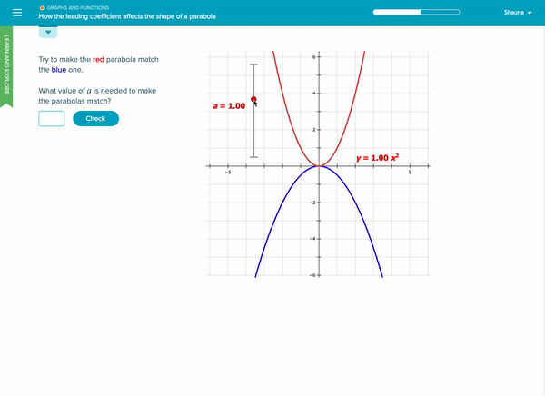
Using Axure, I translated early concepts provided by the content team into interactive prototypes. Each prototype incorporated responsive components such as step-based animations, clickable visuals, and student-driven exploration.
To support accessibility, I ensured designs followed WCAG AA color contrast guidelines, maintained logical tab order for keyboard navigation, and avoided content that relied solely on visual cues. This helped ensure the pages could be used effectively across diverse user needs.


Testing
I partnered with the research team to conduct usability testing with 6 students from grades 5 to 12. Participants reviewed both the current static explanation pages and the new interactive learning pages. We used Microsoft’s Desirability Toolkit to collect qualitative impressions and preferences.

Full list of product reaction words from Microsoft’s Desirability Toolkit.
Key Findings
83% of students found the interactive version to be engaging and easy to use.
While the older students appreciated the interactive version, they still wanted access to the static version for quick review purposes.
4 out of 6 students wanted the ability to skip or fast forward if they already understood the topic.

Lessons Learned
Students respond better to content delivered in smaller, interactive chunks that feel approachable and less overwhelming
Designing interactive learning content requires cultural and contextual sensitivity to ensure inclusivity across grade levels and demographics
A hybrid approach, offering both interactive and static content, can accommodate a wider range of learning preferences and educational needs
Next Steps
Iterate on the design based on feedback from the initial round of testing by adding flexibility and control features (e.g. ability to skip ahead or revisit content) to support more personalized learning paths
Explore more multimedia integrations such as audio, video, or animated guidance to further enhance engagement
Conduct testing with additional grade-level content to validate the model’s effectiveness across a broader student base