Student Dashboard Redesign
Role
UX Designer
Company
McGraw Hill
Tools
Axure
Project Overview
Student Account Home is a dashboard designed to allow students to access multiple accounts through a single login. However, after its launch, critical usability issues were reported by students, instructors, and customer support. Over half of the top 10 monthly call categories received by ALEKS Customer Support were directly related to Student Account Home. This project focused on a visual and workflow refresh to address these issues by simplifying navigation, clarifying account access, and ultimately reducing support call volume while improving the overall user experience.
Goals
Address all usability issues identified by the ALEKS Customer Support Team, ensuring the improved designs are intuitive for students from 2nd grade through college
Update the Student Account Home UI to align with the visual design of the broader ALEKS product
Rework the back-end workflows to match the updated UI
Key Issues Identified
Students were unsure how to access their class, as the class name appeared as plain text instead of a clickable link.
The process for switching out of a class, adding a new one, or extending a license was unclear. Many students defaulted to clicking the prominent "+ New Class" button, which was not always the appropriate action.
Students could accidentally delete their accounts, requiring support to restore them.
The registration process was also problematic in that students had to apply a class access code before creating an account, resulting in inaccessible accounts if the process was interrupted.
Research
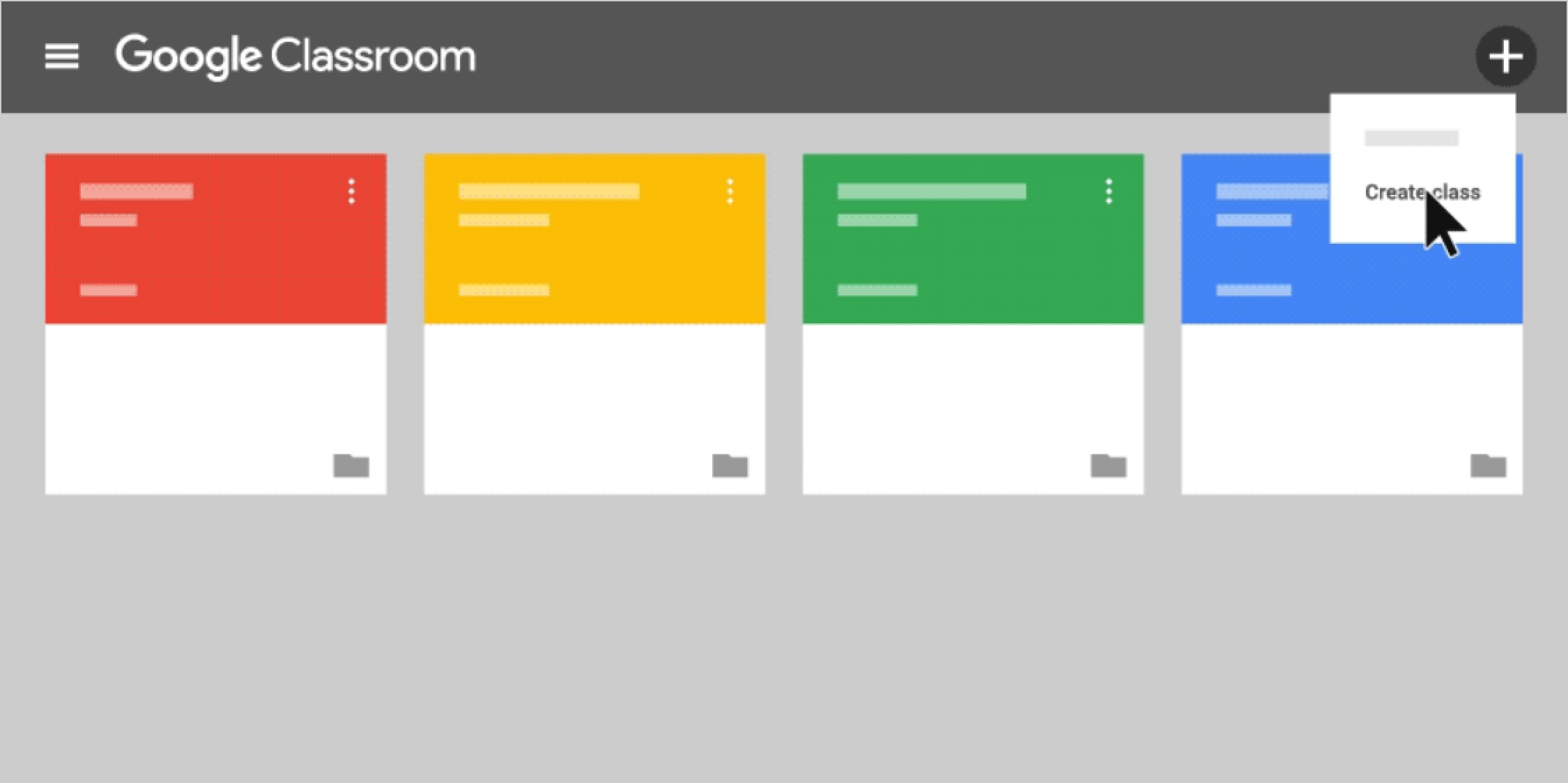
After identifying the major design issues, I examined other classroom management platforms for inspiration. I was drawn to the tile-based layouts used by tools like Google Classroom and Canvas, which felt intuitive given that most students enrolled in only one or two classes. I adapted this layout to fit the ALEKS design style, ensuring visual and functional cohesion with the rest of the platform.
Design
I rapidly prototyped solutions in Axure to explore ways to resolve the usability issues. The revised design introduced a cleaner tile layout aligned with ALEKS’s visual style. I created a single entry point for adding, switching, and renewing classes. To reduce the risk of accidental deletions, I removed the “Delete from my account” functionality entirely. I also reworked the registration flow to be more user-friendly.
Accessibility played an important role throughout the design process. I ensured all updates passed WCAG AA color contrast guidelines and supported full keyboard navigation, making the dashboard more inclusive for all users.
Testing
I collaborated with the research team to conduct 2 rounds of unmoderated usability testing via UserZoom. Participants ranged from 18 to 40 years old and were enrolled in either two-year or four-year institutions.
Key insights from testing:
Students still struggled to identify the clickable class entry point
Users attempted to switch classes by mistakenly clicking into an existing class tile
Important information like class codes was hard to find, as users didn’t realize the tiles could be flipped
Students wanted the ability to hide past classes they no longer needed
An example of a task students completed during unmoderated testing conducted through UserZoom.
Iteration
Based on testing feedback, I made several changes:
Styled class name links to appear more interactive
Renamed the "Add New Class" tile to "Add/Change Class" for clarity
Added a first-time use walkthrough
Introduced a Current/Hidden toggle to help students manage class visibility
Then, I conducted a second round of usability testing with 6 new participants to validate the updates.
Final Design & Implementation
I collaborated with the visual design manager to apply final visual styles and ensured the updated interface aligned with brand standards. I maintained close communication with the engineering team throughout implementation to ensure the experience matched the design.
Outcome
↓ 4.2%
decrease in customer support calls after the release of the updated Student Account Home
This was despite a 17% increase in new ALEKS users. This demonstrated improved usability and reduced confusion.
Lessons Learned
Rapid iteration combined with unmoderated usability testing allowed for quick identification and resolution of key usability issues without delaying project timelines
Designing with accessibility in mind, including color contrast, WCAG AA compliance, and keyboard navigation, ensures the interface is usable for all students
Simplifying user flows by providing a clear, linear path reduces cognitive load and improves overall usability
Next Steps
Continue monitoring feedback from the ALEKS Customer Support Team to catch any new usability issues early
Explore opportunities to make the updated dashboard mobile-friendly to support access across devices


