Improving Release Notes Usability in Product Docs
Timeline
2 months
Scope
Experience redesign, navigation, and personalization
Platform
Product documentation

Problem
ServiceNow’s Product Documentation (Docs) release notes are a critical resource for users planning upgrades, troubleshooting, and staying current with product changes. However, the experience was difficult to navigate. Users often landed on the wrong version, encountered inconsistent content structures, and had to take multiple steps to find relevant information. There was also no way to filter updates by the products they owned, forcing users to scan through irrelevant content. As a result, users spent 8–12 hours per upgrade cycle piecing together release details, creating significant friction and inefficiency.
👉 How might we help users easily find and understand release updates relevant to their version and product?
Before: Users needed 4+ clicks to find release notes by product, with navigation that did not match their mental model.
Approach
The biggest shift came from realizing the experience was designed around release versions, while users think in terms of the products they manage. Users weren’t trying to “read release notes”—they were trying to understand how changes impacted their specific environment.
This led to a shift from a release-first model to a product-first experience. At the same time, I preserved a release-based entry point to avoid disrupting familiar workflows. I focused on reducing navigation friction, minimizing the number of steps required to find relevant information, and introducing a consistent content structure that made updates easier to scan and understand.
A key challenge was the lack of entitlement data, which prevented the system from automatically surfacing product-relevant content. Instead of waiting on a long-term solution, I introduced interim personalization through user-driven controls such as bookmarking apps and filtering by “My bookmarked apps”. This allowed users to immediately focus on relevant updates while laying the groundwork for future system-driven personalization.
Throughout the process, I worked closely with product, engineering, research, and content teams to ensure solutions aligned with both user needs and platform constraints. Even small design changes required coordination with content systems like DITA, which shaped what was feasible within the timeline.
Key Decisions
I introduced product-level entry points to align navigation with how users think and reduce the steps required to find relevant release notes. Content was restructured into standardized, scannable sections so users could quickly understand what changed without reading everything in detail.

To support upgrade planning, I introduced a changelog model that made it easier to understand the delta between releases—addressing a major gap where users previously had to manually piece together changes. Navigation was simplified by consolidating redundant pages and restructuring the table of contents using progressive disclosure, surfacing only what was relevant on each page.
I also introduced user-driven personalization, enabling users to bookmark apps and filter content by “My bookmarked apps.” This provided immediate value despite system limitations and ensured users could focus on updates that mattered to them.
Final Designs

Product-first homepage with personalized apps reduces time and effort by bringing relevant release notes directly to users.

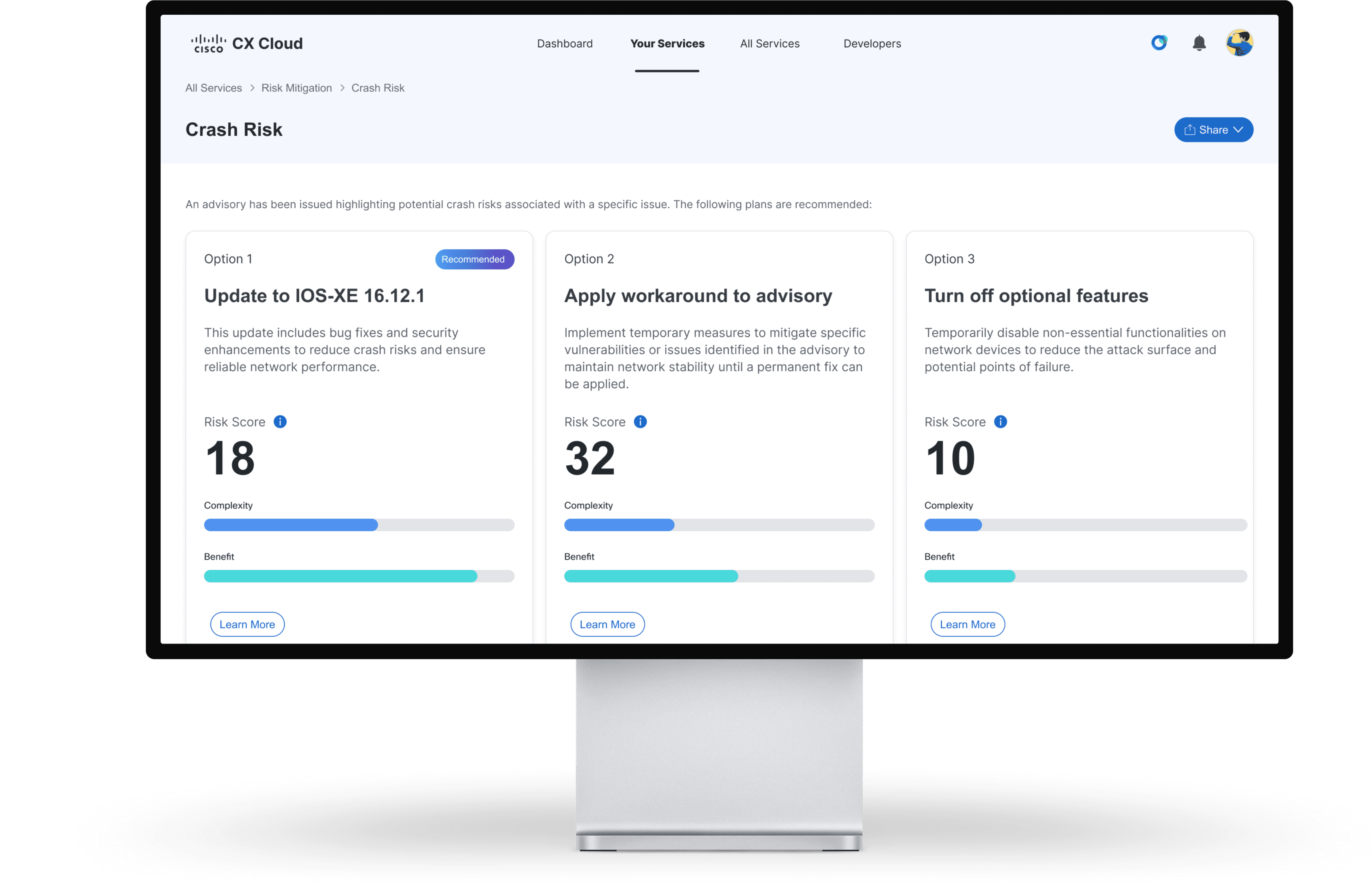
Product-level release notes page makes updates easy to scan at a glance, shows release context, enables quick version switching, and preserves access to release-level notes and full documentation.

Changelog makes it easy to understand what changed across releases, helping users compare updates and plan upgrades with confidence.

Release-first landing page makes it easy to navigate releases with quick version switching, focused content, and filtering by bookmarked apps so users see only updates that matter to them, while preserving access to full release notes.
Tradeoffs
Shifting to a product-first model improved clarity, but required maintaining a release-first path alongside it, adding complexity to preserve familiar workflows. Personalization introduced another tradeoff. Without access to entitlement data, solutions relied on user input instead of automation, increasing effort but enabling immediate value.
Impact
The redesigned experience reduced steps to find relevant release notes and improved clarity around changes between versions, reducing friction across the upgrade workflow. Personalization helped users focus on product-relevant updates, while a changelog improved visibility into changes, supporting more confident upgrade planning. The work will also establish a scalable foundation for a monthly release cadence and will be showcased at ServiceNow’s Knowledge conference to align stakeholders and gather early feedback.
Reflection
The biggest constraint was not the interface, but the content infrastructure behind it. Seemingly simple UI improvements required significant coordination with DITA and existing content models, reinforcing the importance of designing solutions that are not only usable, but also feasible within real-world systems.
It also highlighted the importance of balancing speed and rigor. While I didn’t have the opportunity to run new usability tests, grounding decisions in existing research and stakeholder insights allowed me to move quickly without losing direction.
Next Steps
Validate the redesigned experience through usability testing, focusing on navigation, findability, and comprehension
Use feedback from the Knowledge conference to refine personalization and content structure
Continue evolving the experience as entitlement data becomes available
Other Projects
Projected to reduce support case volume by 3%, saving $15M annually
Standardized 67 components with 100% adoption, improving design and development efficiency

Reduced support calls by 4.2% despite a 17% increase in new users
Copyright 2026 by Jackie Kim