Simplifying the Student Dashboard Experience
to Reduce Support Calls
Timeline
6 months
Scope
Experience redesign, navigation, and workflow simplification
Platform
Learning platform

Problem
The Student Account Home dashboard was designed to help students access and manage their classes, but after launch, it became a major source of confusion. Over half of the top support call categories were directly tied to issues within the dashboard.
Students struggled to access their classes, navigate workflows, and complete key actions like adding or switching classes. Many didn’t recognize what was clickable or how to proceed, and in some cases could accidentally perform destructive actions such as deleting their accounts. As a result, users frequently relied on customer support to complete tasks that should have been straightforward.
👉 How might we simplify the dashboard experience to reduce confusion and support calls?
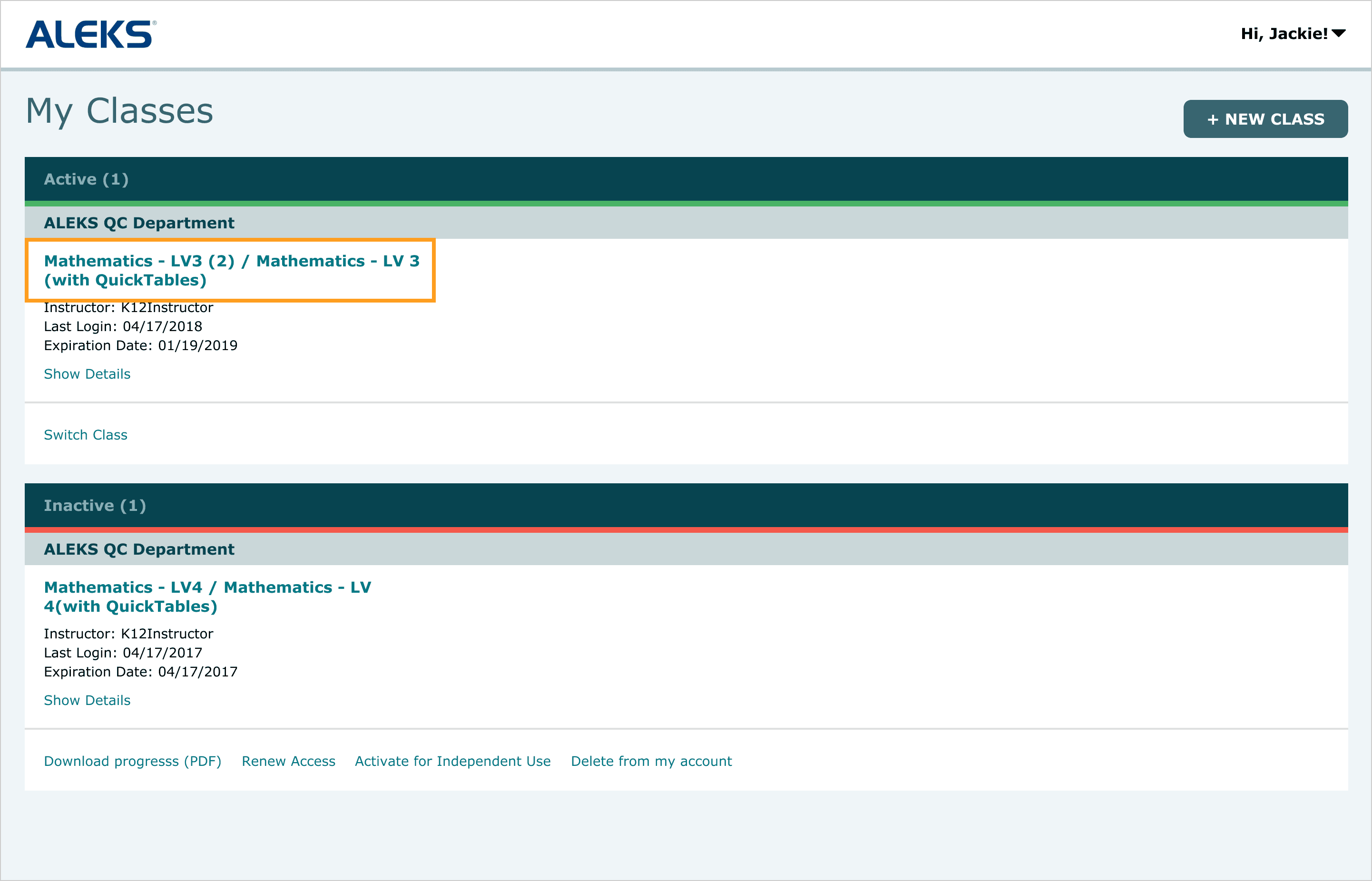
Issue 1: Lack of clear affordance made it unclear that class names were clickable, preventing students from accessing their class.
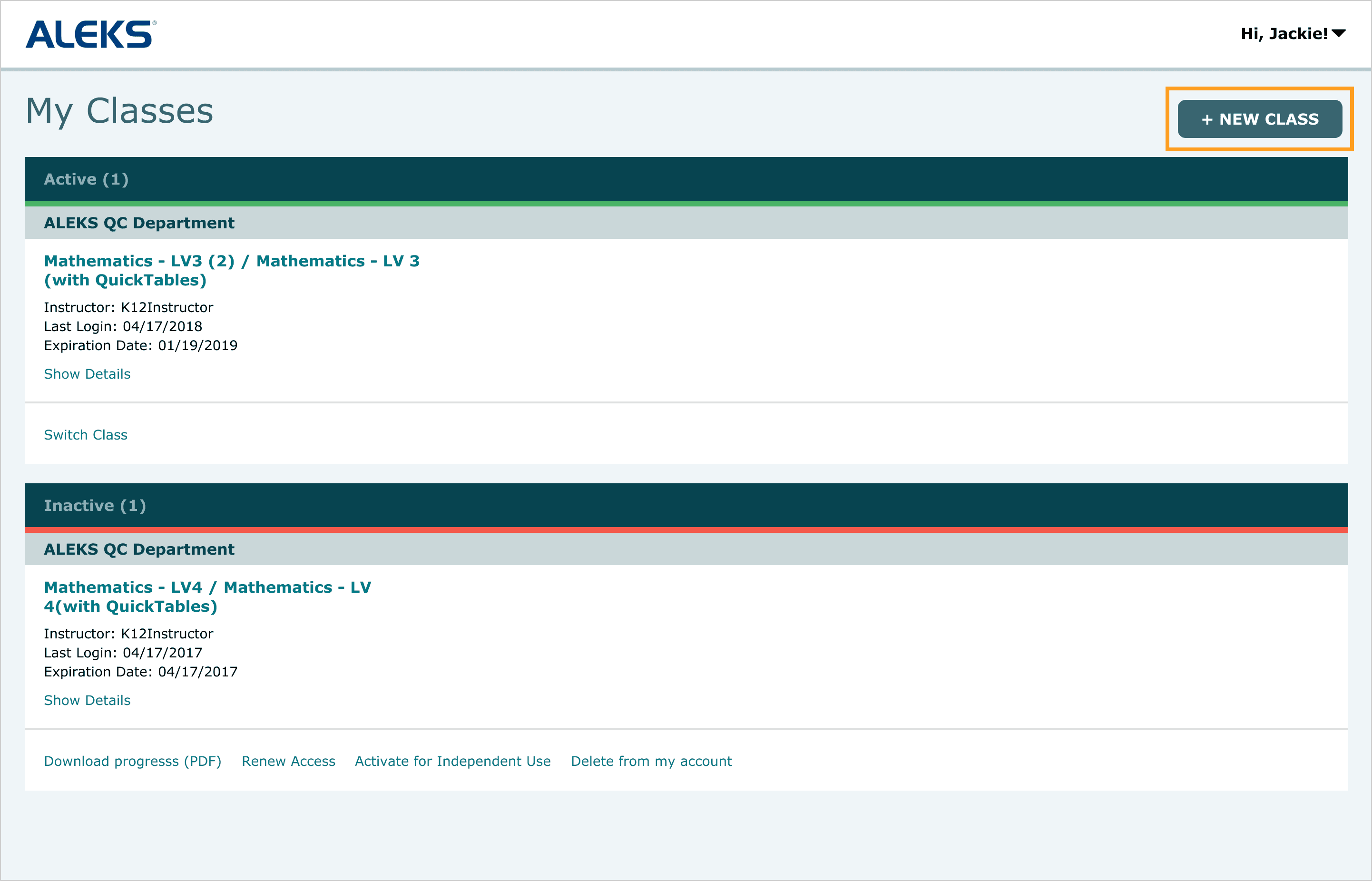
Issue 2: The “Switch Class” action was easily overlooked, leading students to default to the more prominent “+ New Class” button even when switching was the correct action.
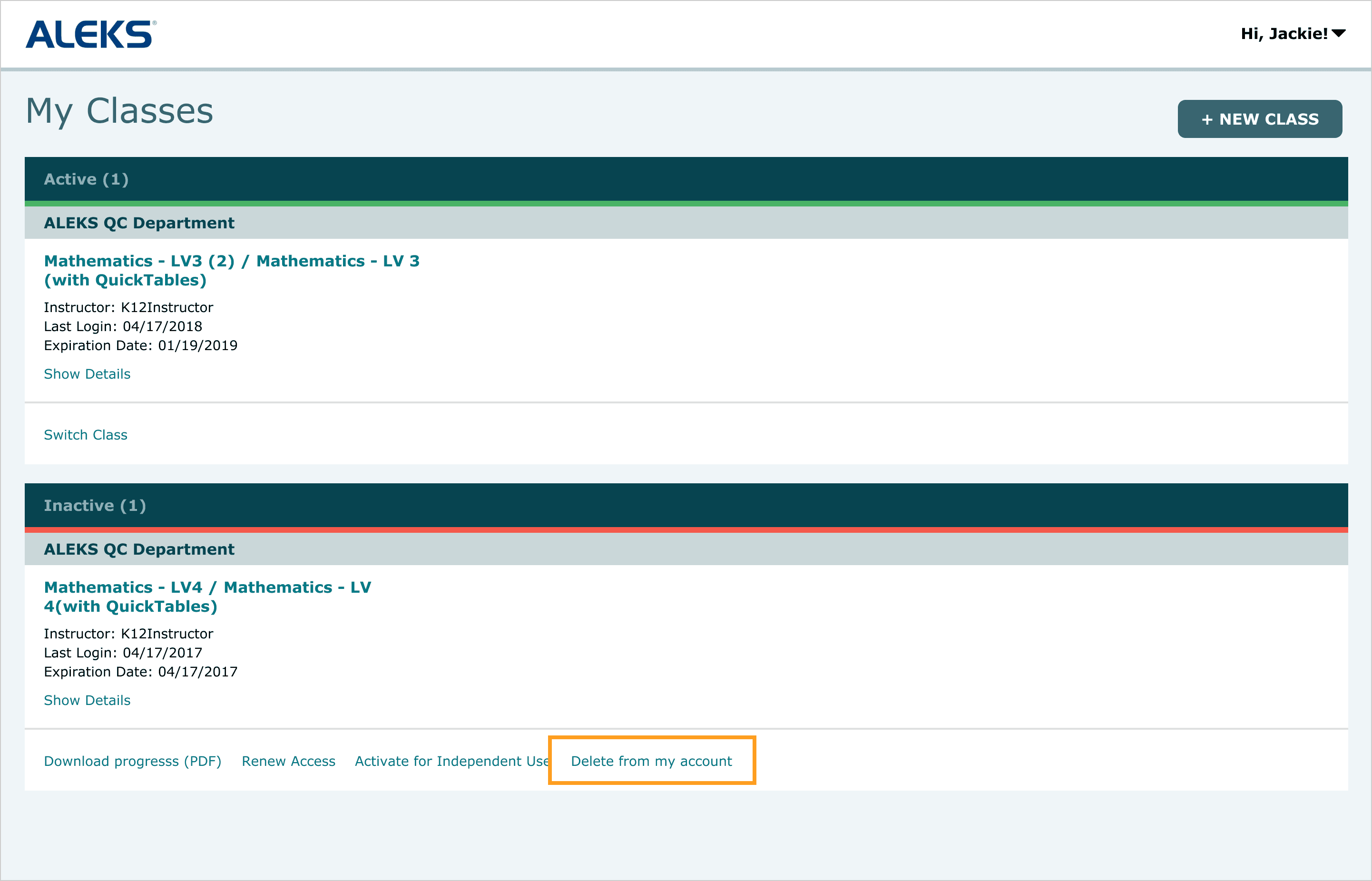
Issue 3: Destructive actions like account deletion were easily accessible, leading to accidental deletions that required support intervention.
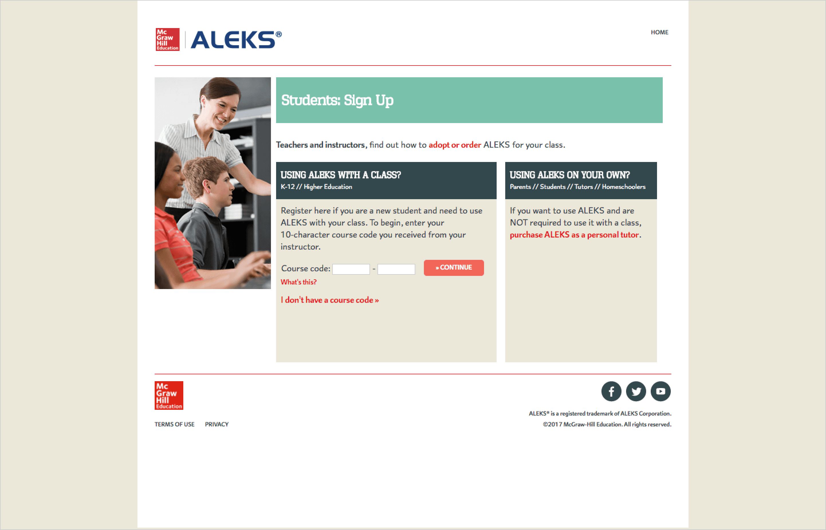
Issue 4: The registration flow required applying a class access code before account creation, leading to inaccessible accounts when the process was interrupted.
Approach
I started by analyzing support data to identify the most common failure points, then examined other classroom management platforms to understand how they structured class access and navigation. Many issues traced back to users not recognizing what actions were available.
I was drawn to tile-based layouts used by tools like Google Classroom and Canvas, which felt intuitive given that most students only manage one or two classes. I adapted this pattern to fit the ALEKS design style, ensuring visual and functional cohesion with the rest of the platform.
I focused on making available actions clear and ensuring key tasks were easy to find and complete. At the same time, I partnered with product and engineering to rework backend workflows, ensuring changes to the registration flow were reflected in the front-end experience.
Key Decisions
Initial redesign of the dashboard, introducing a tile-based layout and consolidated class actions prior to usability testing.
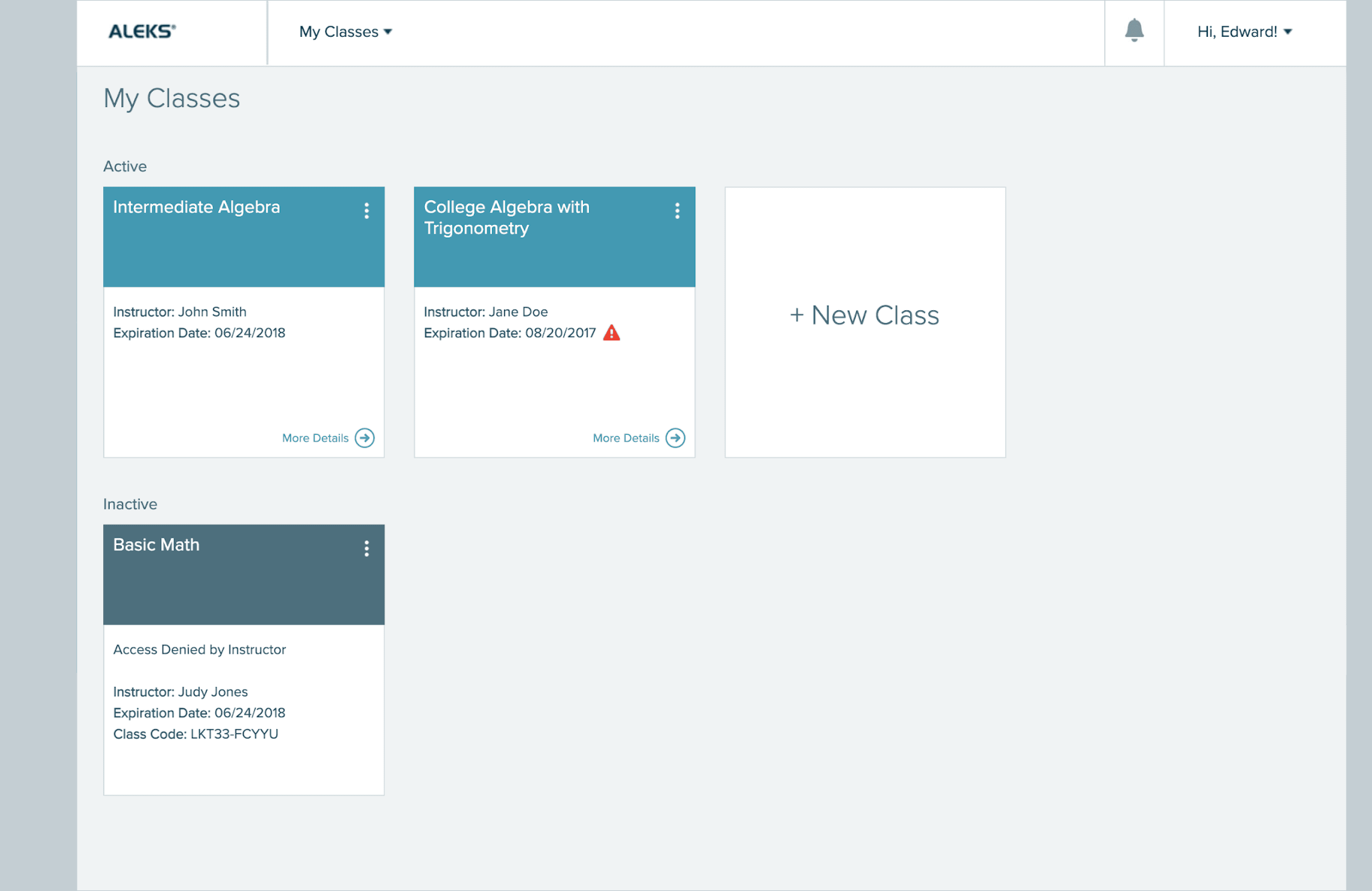
Introduced a tile-based layout and increased the prominence of class names, making it clearer where to click to access a class.
Combined the “Add New Class” and “Switch Class” flows into a single entry point, allowing students to start by entering a class access code before being guided into the appropriate flow. If a student already had an active class, the system prompted them to either switch or add a new class, removing the need to choose a path upfront.
Removed high-risk actions such as account deletion, preventing mistakes that required support intervention.
Redesigned the registration flow to ensure account creation was completed before applying a class access code, eliminating scenarios where accounts became inaccessible.
Validation & Iteration
I conducted two rounds of unmoderated usability testing via UserZoom, with participants aged 18–40 enrolled in two- and four-year institutions.
Unmoderated usability testing conducted through UserZoom to evaluate key tasks and identify friction points in the dashboard experience.
The first round surfaced several key issues. Students attempted to switch classes by clicking into an existing class tile, and important information like class codes was difficult to find, as users didn’t realize the tiles could be flipped. Students also expressed a need to hide past classes they no longer needed.
Based on these findings, I made several updates to improve clarity and usability. I renamed the “Add New Class” tile to “Add/Change Class”, added a first-time walkthrough to surface available actions, and introduced a Current/Hidden toggle to help students manage class visibility.
I then conducted a second round of usability testing with six new participants to validate the updates. The second round showed improved task success and reduced confusion across key flows.
Final Design
First-time walkthrough orients new users by highlighting key actions and where to find them.
Renaming to “Add/Change Class” and consolidating both flows into a single entry point made it clearer that users could add or switch classes, eliminating the need to choose a path upfront.
Restructured registration flow prevents users from getting stranded without a login by requiring account creation before applying a class access code.
“Hide Class” functionality, introduced based on usability testing, allows users to move inactive classes to a Hidden tab, reducing clutter and improving focus.
Tradeoffs
Combining “Add New Class” and “Switch Class” into a single entry point removed the need to choose upfront, but required users to follow a more guided flow rather than jumping directly into a specific action.
Impact
Following the redesign, support calls decreased by 4.2% year-over-year, despite a 17% increase in new users. By clarifying affordances, simplifying workflows, and reducing error-prone interactions, the experience made it easier for students to complete tasks independently. The redesign not only improved usability, but also reduced operational burden on support teams, demonstrating the direct impact of better UX on business outcomes.
Reflection
Although several usability issues were rooted in visual problems like affordance, lack of prominence, and unclear labeling, some of the most impactful improvements required changes beyond the interface. Fixing the registration flow meant working closely with engineering to align front-end clarity with backend logic and prioritizing updates based on what would have the highest impact.
Next Steps
Continue monitoring support data to identify new friction points
Refine workflows based on ongoing user feedback.
Extend the experience to mobile
Other Projects

Reduced time and effort required to find version-and product specific release updates
Projected to reduce support case volume by 3%, saving $15M annually
Standardized 67 components with 100% adoption, improving design and development efficiency
Copyright 2026 by Jackie Kim